
I would’ve loved that back when I was playing a lot more


I would’ve loved that back when I was playing a lot more
Pure theme ftw


True, it’s a shame it’s so easy to lose the episode you enjoyed before tho :/


Jokes aside, kids shows are good as they have basic language in them


If you want to learn a language, surround yourself with it. Watch shows, play games, read articles, change language of your phone. If you don’t understand something, translate it. Use it. Apps are just empty practice if you don’t apply it
The thing is, it only breaks sometimes (usually when I need it the most lol). Both are installed and I don’t think it would only not work sometimes if they were missing. I’m thinking of hopping to another distro haha I know it’s not arch’s fault, but this excuse is as good as any lmao
The browser is on flatpak but I tried the same thing on steam which isn’t and it still doesn’t work


I saw a comment somewhere that said: “people have been burnt by Microsoft too many times, while Apple still has a benefit of the doubt for many people in regards to privacy”. People still have some trust in Apple, compared to MS.
Edit: Found the comment by @deweydecibel@lemmy.world
If Apple announced Recall? Apple wouldn’t announce Recall, that’s the whole point. Apple wouldn’t be so brazen and stupid to push a tool that is so obviously invasive and so poorly implemented. Apple earned its trust by not making those mistakes.
But if they did decide to say fuck it and implement something like Recall, of course people would trust them. That’s what trust means: consumers take them at their word. But if it’s as bad as Microsoft’s Recall, Apple would burn all that trust when people found out.
People don’t believe Microsoft because they have long since burned any trust and good will for most of their consumers. They have proven time and time again they don’t give a shit about users’ wants or needs, and users have felt that. So when they announce Recall, they have no earned trust. No believes them. There’s no good faith to cushion this. And it turns out everyone was right not to grant them that trust.


Warm overcast day with light wind


You can type it with one hand. Also, you have other buttons on the top bar, like extensions, settings, arrows, home etc


Fun fact, even if you delete the comment I can still read it in the notification lmao. And they only KINDA did


It does, but… it’s sounds cool to do everything with the keyboard and all, but in everyday use sometimes you have the mouse in your hand, or only one hand available. I don’t want to be thinking „oh yeah I need to do that instead”, it’s not comfortable anymore, even if it’s not as efficient


Floorp also exists :)


Im a simple man, less browser UI = good. I only want to see what I need to see. I’d hide the address bar if it wasn’t cumbersome to use with hover (as in hover at the top of the browser window to show the address bar).
It’s more efficient to stack wide elements on top of each other than next to each other.
Especially with websites that are optimised for mobile which means they use only the middle 60% of the whole 16:9 screen, not to mention ultrawide. So vertical space is needed more than horizontal space.
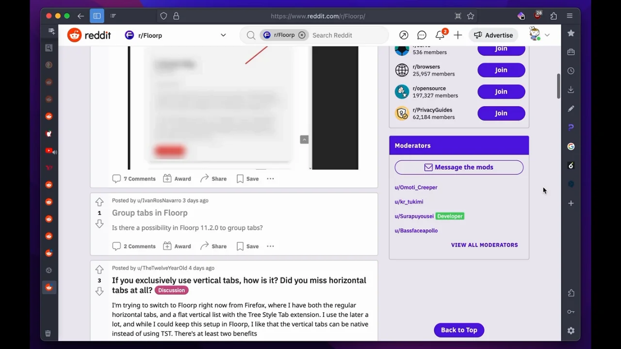
In addition, you can have the vertical tabs hide the text, so you can only see the favicon, unless hovered over. I basically have a 50px bar on the left and top. So this (without the right sidebar, I’m not at my PC so I stole the photo from Reddit :P) :


Polish - „you can’t make a whip out of shit” „z gówna bicza nie ukręcisz”


I read the How Linux Works one, it seemed pretty basic, maybe a bit too basic. Plus if you don’t practice the theory in them you’ll forget whatever you read. At least I did lol. All in all, pretty meh
I tried the command line one as well, but couldn’t get through it. Let’s be honest, do you really want to read 300 pages of commands? lol
If you want to learn anything about those topic in these books, practice. You can read all you want but it’s a waste of time if you don’t use it
I’m talking to my past self a bit lmao
I think it’s easier to fix issues on Linux than Windows at least. It’s not as obscured by Settings, Control Panel, Advanced Settings, Properties, and Registry in the worst case
Can’t recommend channels or guides of the top of my head, but maybe search Linux Mint beginner guide or something. Linux Mint is recommended everywhere for people who are new to Linux and should have plenty of guides and answers


😏? 😉? 👍 🫦🍆✊👅💦💦🤤😪
Who needs a language
All gaming YouTubers, except for Byze. I can’t stand screaming every 5 seconds for no reason anymore. I’m getting old