Here I’m still waiting for an official vertical tabs feature.
This is not even close to the worst thing they have ever done, but stuff like this is a waste of resources. People mostly want official vertical tabs and more than anything engine performance improvements. (and the ability to pretend to be Chrome in Youtube)
I really hope you can turn this off
Please work on tab grouping instead!
Now this would be useful.
It was useful 8 years ago when they removed it, that’s for sure.
Or vertical icon-only tabs!
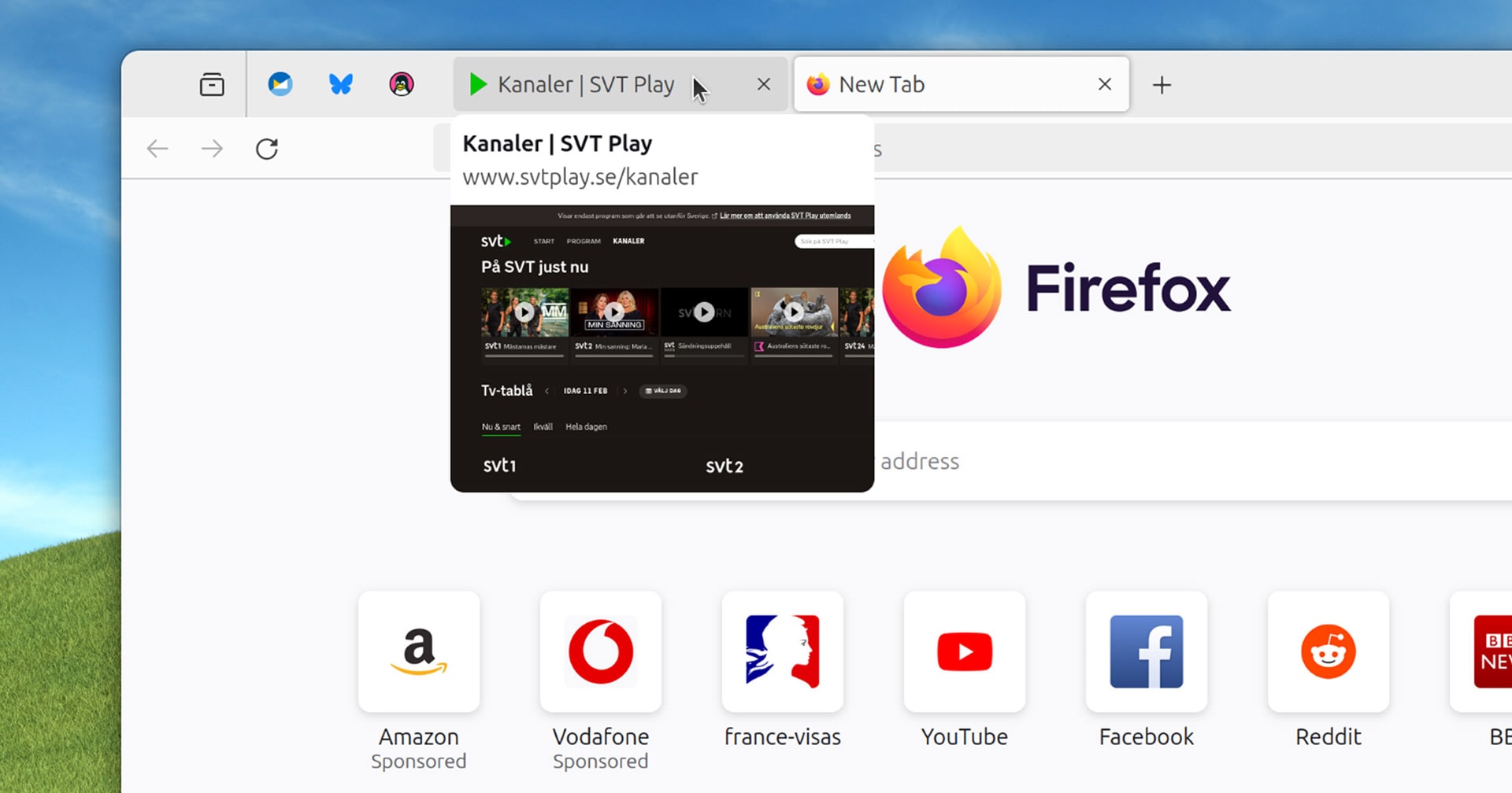
In current versions of Firefox you hover your mouse over a non-active tab […] to see (after a small delay) a tooltip containing the web page title.
Uh… what is the point of that? If I am looking for a specific tab then:
- I probably want to switch to the tab that I am looking for, so staying on the current one is not required
- if there are a few tabs from different pages from the same domain the difference might be hard to see on a thumbnail (similar page headings with logos)
- and most importantly: opening the tab is faster than waiting for the delay anyway
This sounds like a “cool” feature that’s looking for an actual problem to solve.
Tooltips are a standard accessibility feature. Just because you may not find them helpful doesn’t mean others do not benefit. The delay is to ensure they don’t get in the way unintentionally (but still allow usage) for those who do not need the accessibility benefit at all times.
In the vast overwhelming amount of cases tooltips show additional information that you cannot see from clicking on something or provide an explanation to an option that isn’t available without scrounging through a manual. None of those apply here.
The page title isn’t necessarily visible on the web page that sets the title.
Clicking is not always a simple task.
I shouldn’t have to leave my current page just to figure out what another tab is.
Again, just because you feel something is useless or easily avoided doesn’t mean that all internet users feel the same.
I think many people in the comments suffer from some version of curse of knowledge.
Sure, this feature us quite irrelevant for a power user who is quick to navigate the browser and needs a split second to remember what tab it is simply by reading the header and seeing the icon.
However, many less proficient people can benefit from this feature. Not once I saw how someone who has 10 tabs open and needs to go to a different webpage, starts meticulously clicking through every single one of them because they have no idea how the page they are looking for is called, they are too overwhelmed by using web as a whole to take notice.
I don’t understand how someone can have 10 or more tabs open. The times when I have “many” tabs open is when I’m looking for references while doing art, and that still hardly ever surpasses 5 tabs! XD


