Just a friendly reminder that there’s accessibility problems with dark themes.
For me dark themes look like this because I have astigmatism:
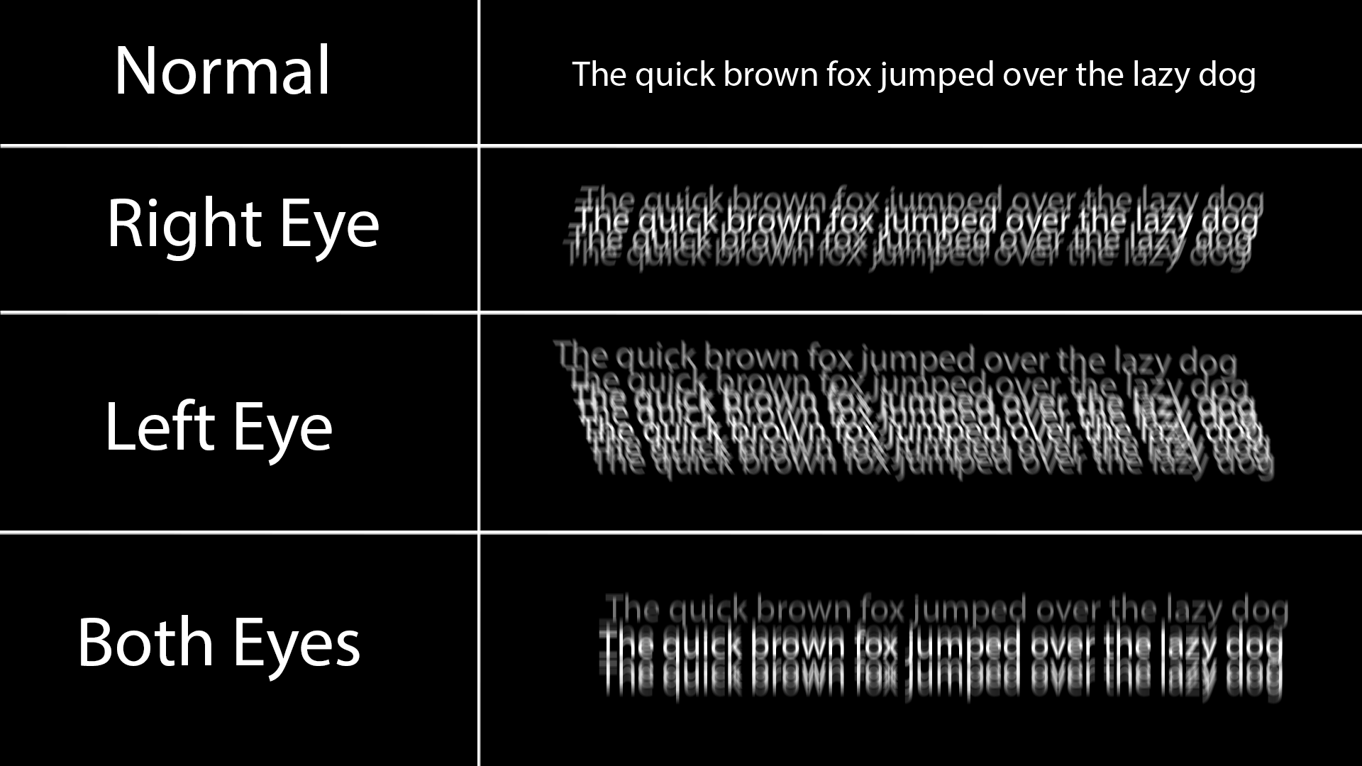
Black on white doesn’t have this issue because all the white around it does is slightly blur into the black text and makes it a little grey at worst.
Any dark theme for a longer period of time also causes the white text to burn in my retina for a couple minutes, and I just see lines when I look away, and also makes reading a long article difficult and painful.
Dark themes look so much better, but keep in mind some people have very good reasons to prefer light themes. There’s no need for dark theme elitism.
Well TIL, thanks for the graphic!
Nobody watched the video lol, dark themes are an easy fix but not the best solution. But very interesting, thanks for sharing
btw you can get glasses if you have astigmatism. certainly made my life easier.
I’m certainly not that bad, but I see where you are coming from. I like a very light grey text on a medium to dark background for this reason that white text on black ‘shadows’
The point of the video is that current default themes (particularly light themes) are too high contrast and too monochromatic. And in that scenario, a dark theme becomes a necessity because a high contrast dark theme is usually better received than a white one.
If you are on Android, repainter can be really nice to find an accessible background/foreground combo using the new Material You theme engine. I get the impression it wasn’t designed for that purpose but it does the job if you try to use mostly Material You apps.
I like light themes and agree that they can be done well. Overall my problem with dark themes is they are too low contrast everything melts into everything else. Who doesn’t want a distinct border around a window?
I think what Brodie showed at the end was already really great. I know a graphics designer and number 1 rule is to never use black and white.
But of course this only works if you have full control over all apps, libadwaita? Dont theme my apps? Damn Electron?
To be honest, this seems to me like a pretty bad take with weird and kind of BS arguments. Why are professional designer, both those working for some of the biggest tech companies and those working in open source project, making these choices? It couldn’t be for actual reasons or because they actually prefer it like that. No, they are “afraid of color”. Or implying that dark theme exist because of these black on white themes, as a mean to escape it. It just weird backwards logic to justify his taste and shouldn’t be necessary to just state that he prefer a different kind of themes.
To me, the Windows themes he showed as positive examples look way to cluttered and busy, even though they don’t show this much information. I don’t need the theme to be “exiting”, I need them to display the information in an easily readable way. And dark theme aren’t there just for people who dislike the modern light theme. Having a light and a dark theme (and ideally having the app follow your system preference) actually serves a purpose. You can actively switch between them depending on the context, the time of day, the brightness of the room or any other reason to make the screen easily readable and comfortable to look at.
I have astigmatism, so I can’t work with dark themes. I can’t read correctly when everything is black around. For me, the perfect theme is the one that has a black window manager, gray variations on specific widgets, and white windows (the background desktop image I prefer it to be blue-ish). Basically, to work properly, I need a mostly light, but mixed environment that provides contrast. Not all white, and definitely not all black. So far, I haven’t found such a theme, because no GUI environment allows for such specificity in theming for the various widgets. Although the default Gnome theme ain’t too bad.
Can’t go away from Breeze Dark.
Layan with a transparent Kvantum theme
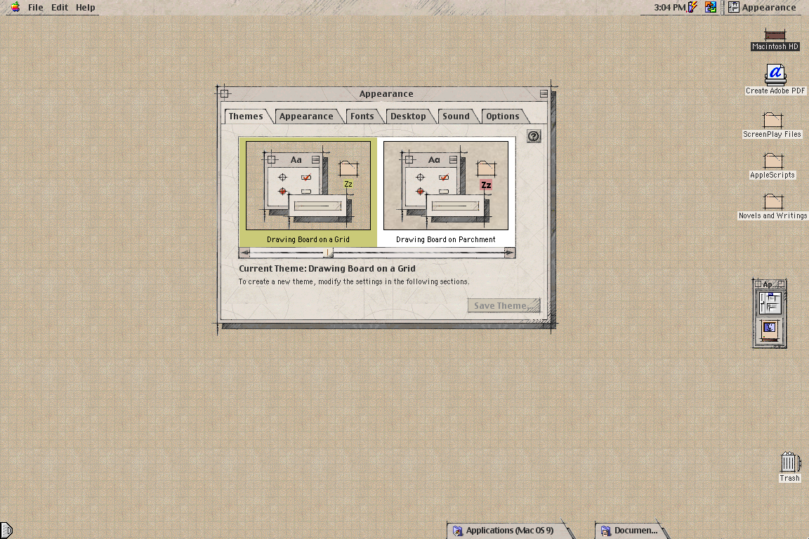
Not what you asked (Plasma theme), but my favorite UI theme since always has been MacOS Drawingboard:
https://www.appimagehub.com/p/1219916Wishing it was possible on Linux for +20 years…
If you add an “!” Before the image link it is displayed in line!
I use a Medium theme on my desktop. It’s not dark or light. It really works for me.
I found it here, https://github.com/blue-mood/blue-mood-kde-color-scheme
I was actually looking for a Med-Dark charcoal theme and decided to try this first. I’ve used it for years now.I tried making a KDE theme too and it either looks like that, or random parts are colored differently.
But everything blue… haha no thanks
I might consider using a light theme if I had a nicer monitor and a clean desk.
I just refuse to watch any YT video where they make a face like this in the splash image.
OP, if this video is yours, sorry, but not very.
De-arrow is a godsend for these thumbnails.
That being said, I set a “Don’t recommend channel” on Brodie Robertson because he took part in harassing a developer about some barely nsfw furry art being hidden in some software but refuses to block Nazis from his mastodon profile. It seemed like a double standard that demonstrated tolerance for said Nazis.
Fuck Nazis. Raw. With a rusty iron cactus. Dry. In the ass.
If that’s what gets you going :s
( ͡° ͜ʖ ͡°)